DGS Logo and Branding
Description
DGS
At Deary’s Gymnastics Supply (DGS), I led a visual brand refresh to bring clarity, consistency, and a more modern identity to their established presence in the gymnastics equipment industry.
Typography
Font usage across platforms had been inconsistent. To unify the brand’s visual language, I selected Urbanist, a versatile Google variable font that provides a wide range of weights and styles. Its clean, contemporary design supports both print and digital applications, and ensures seamless integration across platforms.
Logo Modernization
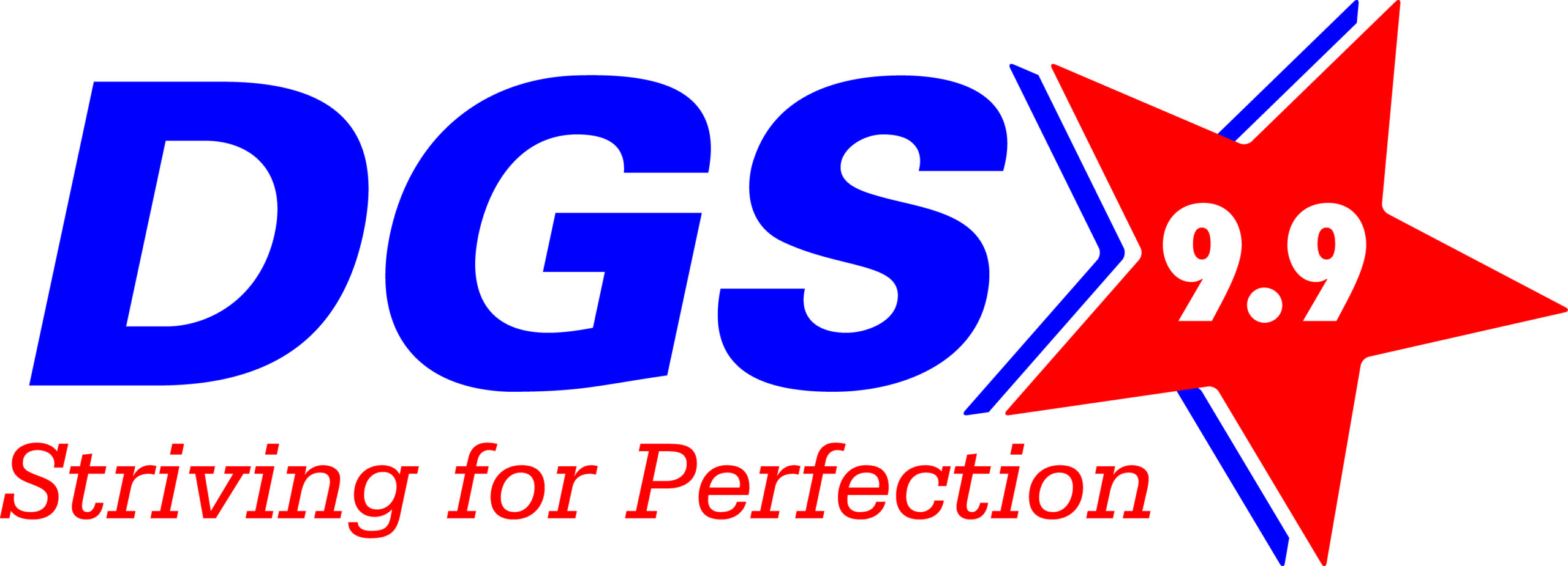
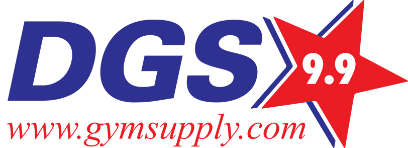
The previous logos had multiple variants and outdated elements. One version featured the tagline “Striving for Perfection” and the text “9.9” inside the logo’s star—a reference to the now-retired 10.0 gymnastics scoring system, which became obsolete in 2006. As a team, we determined that this reference no longer reflected the brand’s future-facing identity. I replaced the “9.9” with “Since 1993” to highlight the brand’s longevity and reinforce credibility.
The old color scheme also leaned heavily on bright red, which created confusion with DGS’s sister brand whose primary color is red. Historically, however, DGS has led with blue—a color featured prominently across their mats and equipment. To reconnect with that legacy and create visual differentiation, I redesigned the logo with a brighter blue star, paired with black lettering and shading for improved contrast and flexibility. This color combination allows for easy inversion (black to white) for use on both light and dark backgrounds.
Two logo versions were finalized:
- One featuring “gymsupply.com” (without “www”) for general use
- One with no tagline, designed for applications like the website, internal documents, some trade show materials, and co-branded placements with the sister company—where URLs are often listed separately
This branding update brought cohesion and modern relevance to DGS’s visual identity while honoring its established history in the industry.